Image © Quark Studio Architects
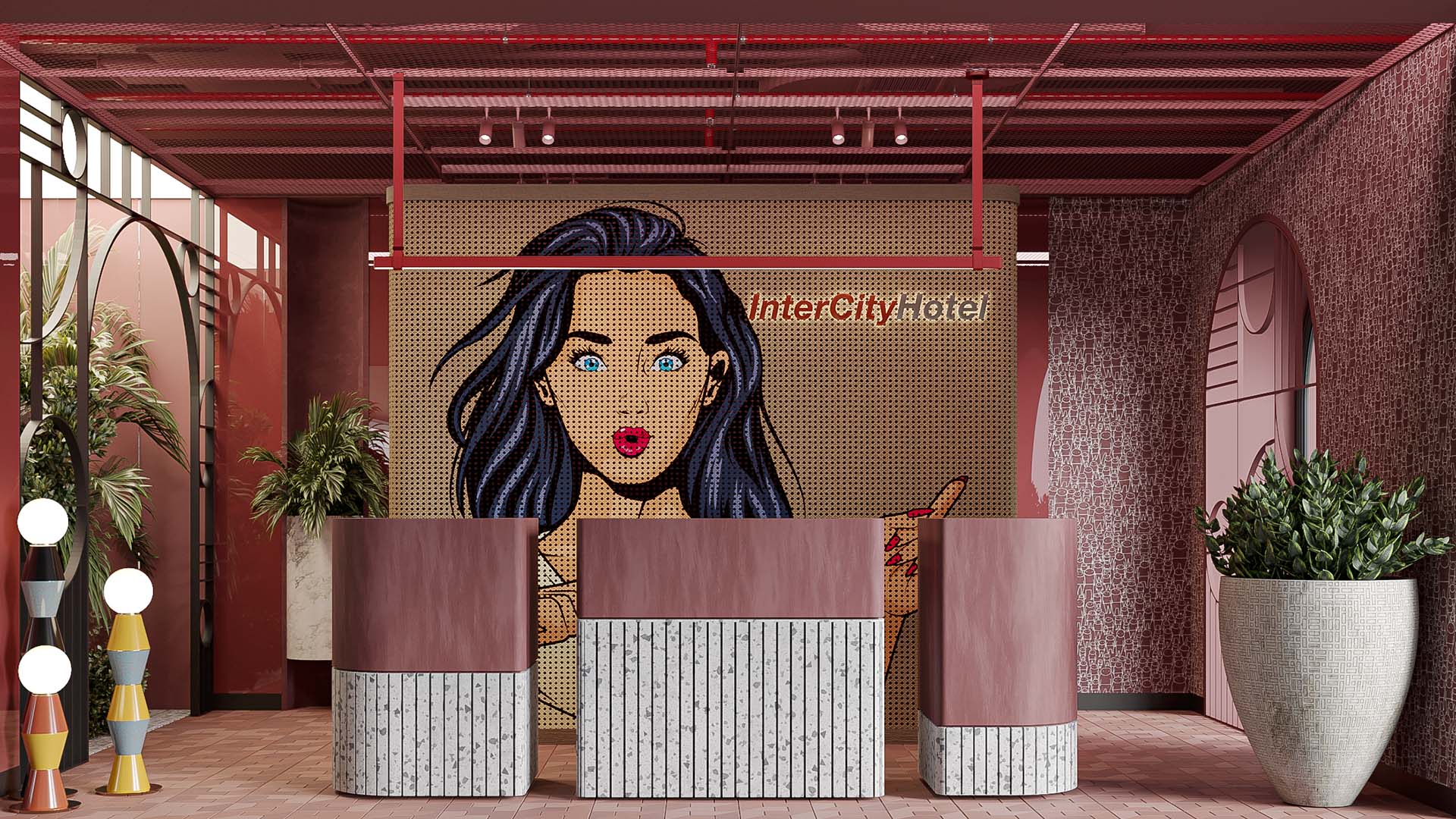
Image © Quark Studio Architects
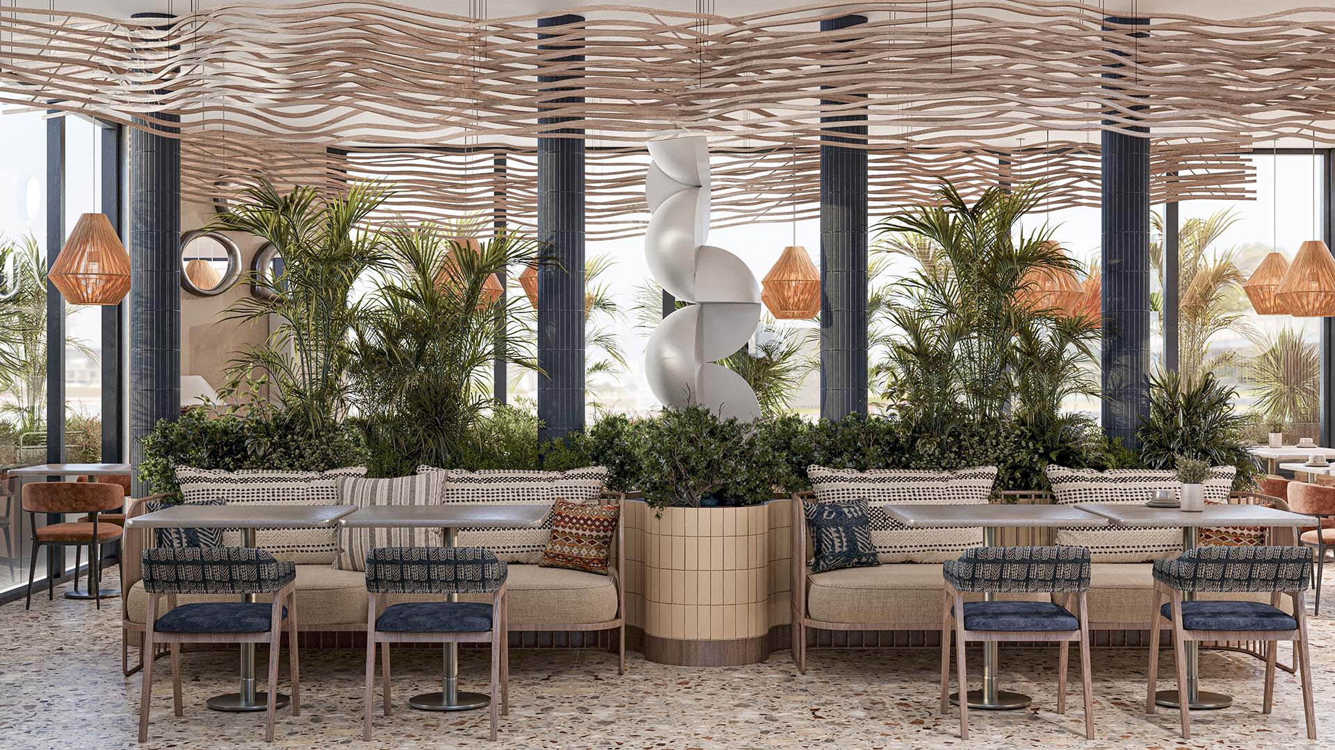
Image © Quark Studio Architects
Intercity Hotel
Tashkent, UZB
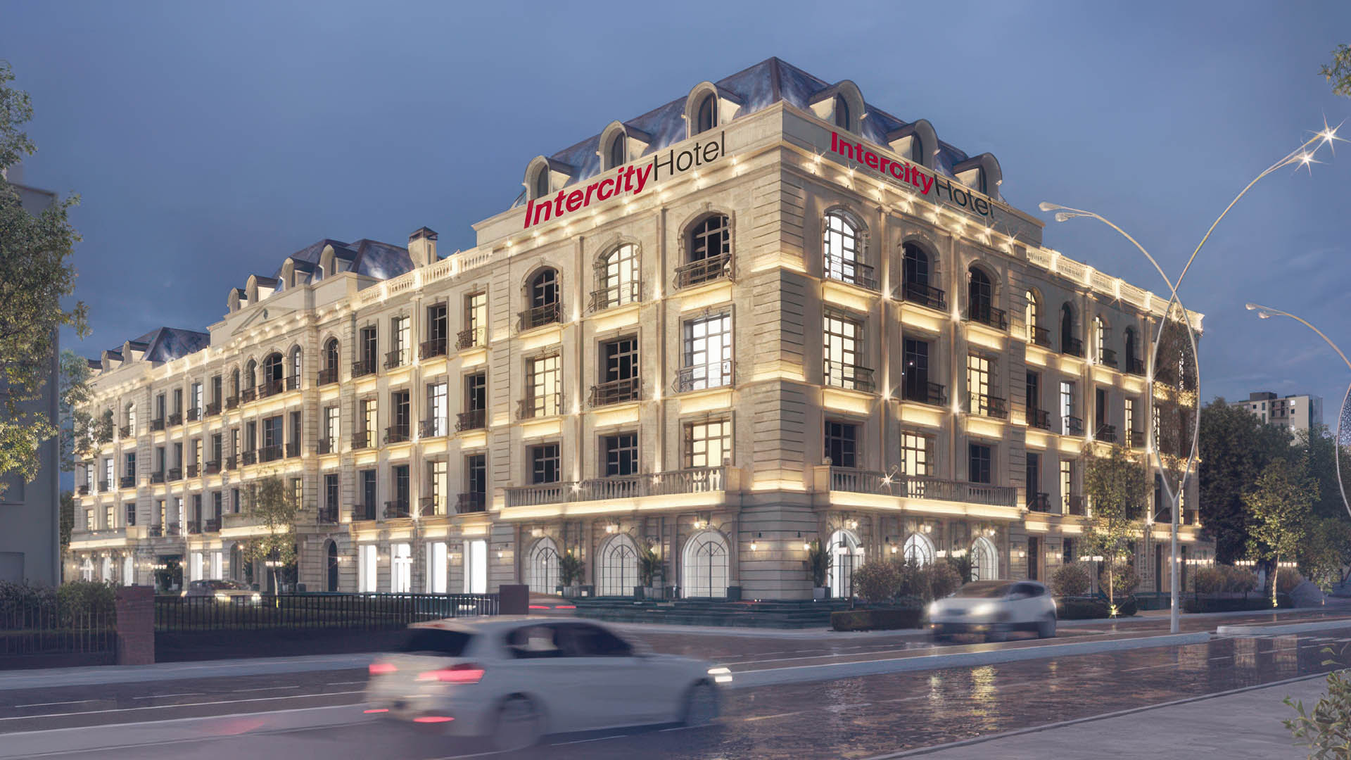
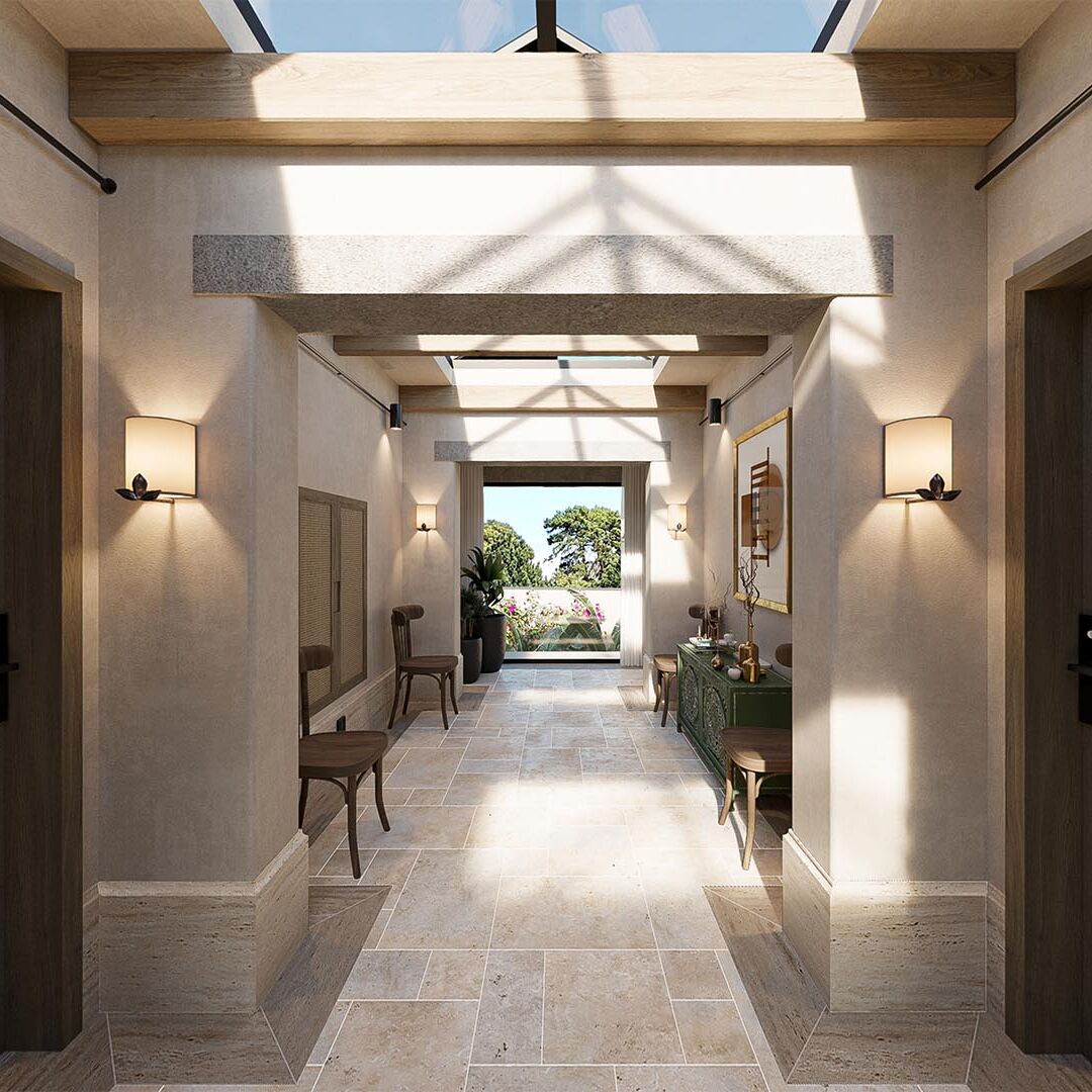
Within the dynamic urban context of Tashkent, Uzbekistan, the Intercity Hotel presents a compelling exploration of spatial articulation and sensory engagement. Spanning 10,160 square meters across six levels, the project orchestrates a nuanced sequence of interior spaces, each meticulously crafted to engage the senses and foster a welcoming atmosphere for global travelers. More than just accommodation, the Intercity Hotel offers a curated experience defined by a thoughtful interplay of colour, texture, and spatial articulation.
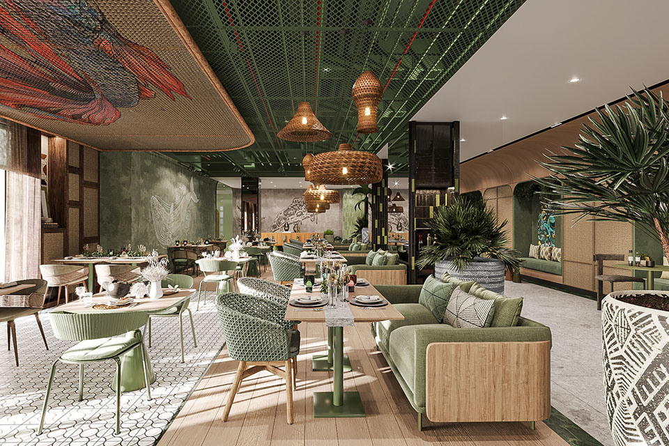
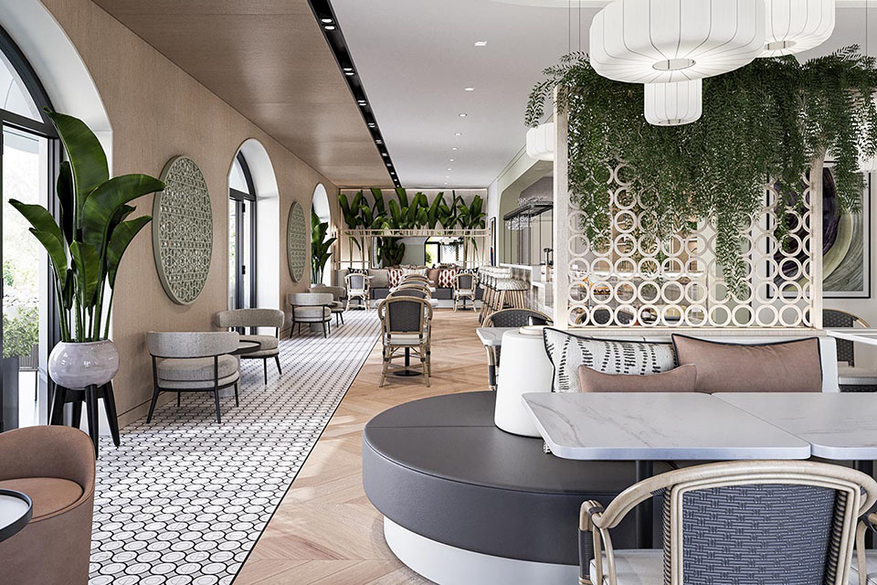
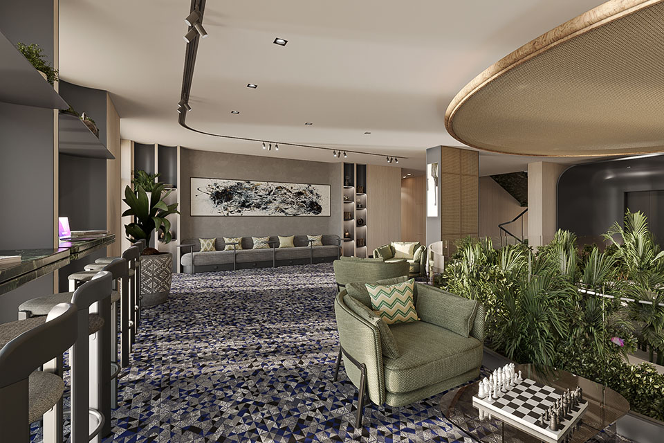
The interior architecture of the Intercity Hotel unfolds as a carefully choreographed spatial narrative, guiding guests through a sequence of distinct yet cohesive environments. The strategic selection and application of materials are central to defining the unique character of each zone. Throughout the public areas, a rich interplay of visual and tactile textures is deliberate. Patterned flooring serves as a grounding element, while distinctive wall treatments and well-considered feature walls add layers of visual interest and depth. This sensory richness contributes to an engaging atmosphere, stimulating curiosity and enhancing the overall experience.
Serving as the initial point of encounter, the reception area makes an immediate and impactful statement through its bold application of a predominantly red palette, sharply contrasted by crisp white detailing. This bold colour choice aims to project an immediate sense of energy, warmth, and welcome, aligning with the core values of hospitality. Red, often associated with dynamism and invitation, creates a strong first impression, while the white accents introduce a sense of clarity, modernity, and balance to the space.
The colour red transcends its role in the reception, subtly weaving its way as an underlying thematic element throughout the majority of the hotel’s public spaces. This consistent yet nuanced application of colour serves as a powerful unifying device, creating a sense of visual continuity and intuitive flow between different areas. Whether expressed in architectural finishes, furniture upholstery, or carefully selected artwork, the strategic presence of red reinforces a feeling of warmth, hospitality, and cohesive brand identity, contributing to a more integrated and memorable guest experience.
The integration of natural elements plays a crucial role in shaping the ambiance of the Intercity Hotel. Lush greenery is strategically placed throughout the public spaces, introducing vibrant color, natural textures, and a refreshing quality to the interiors. This deliberate connection with nature provides a visual counterpoint to the warmer tones, fostering a sense of balance and tranquility within the dynamic environment.
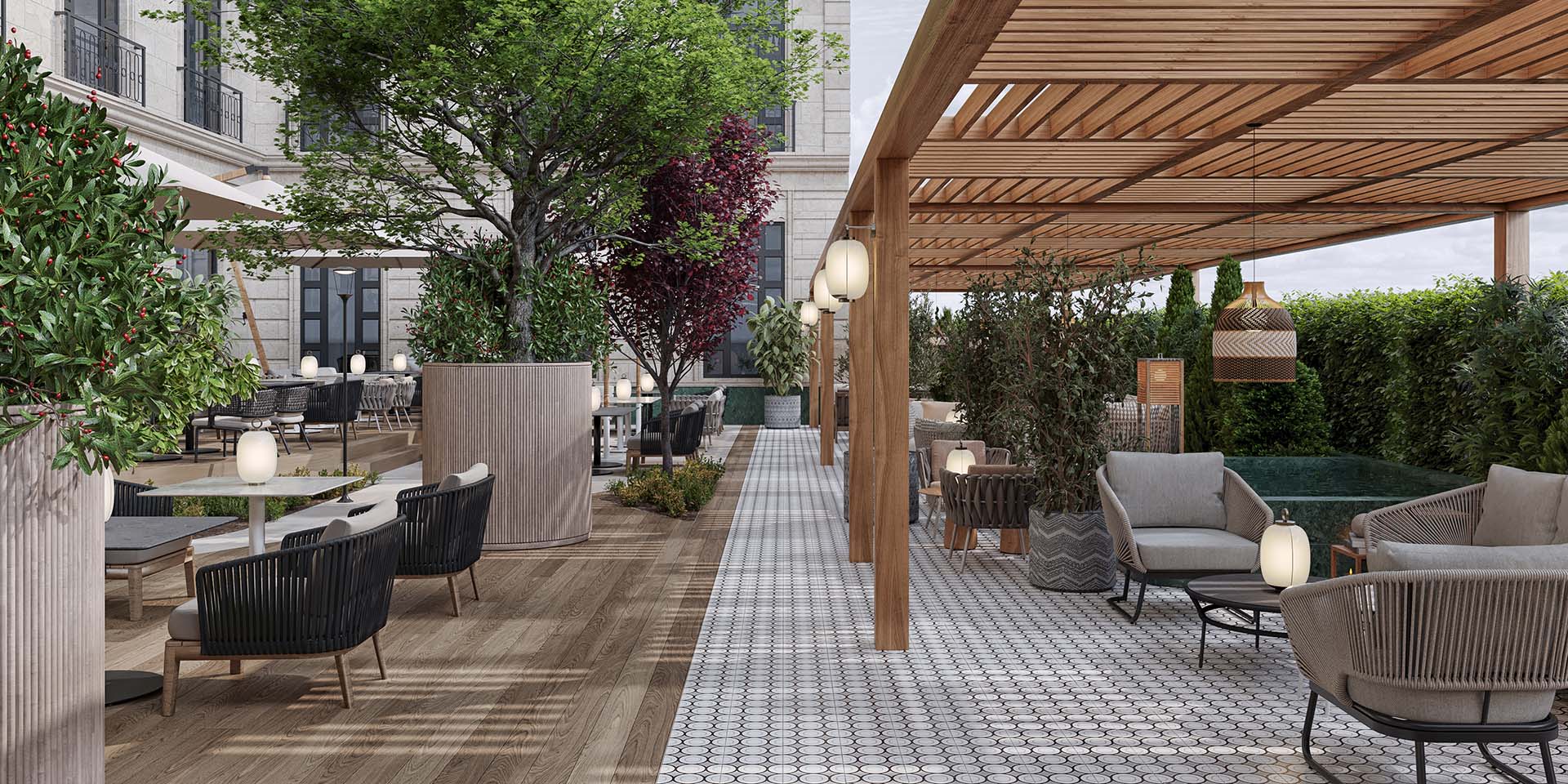
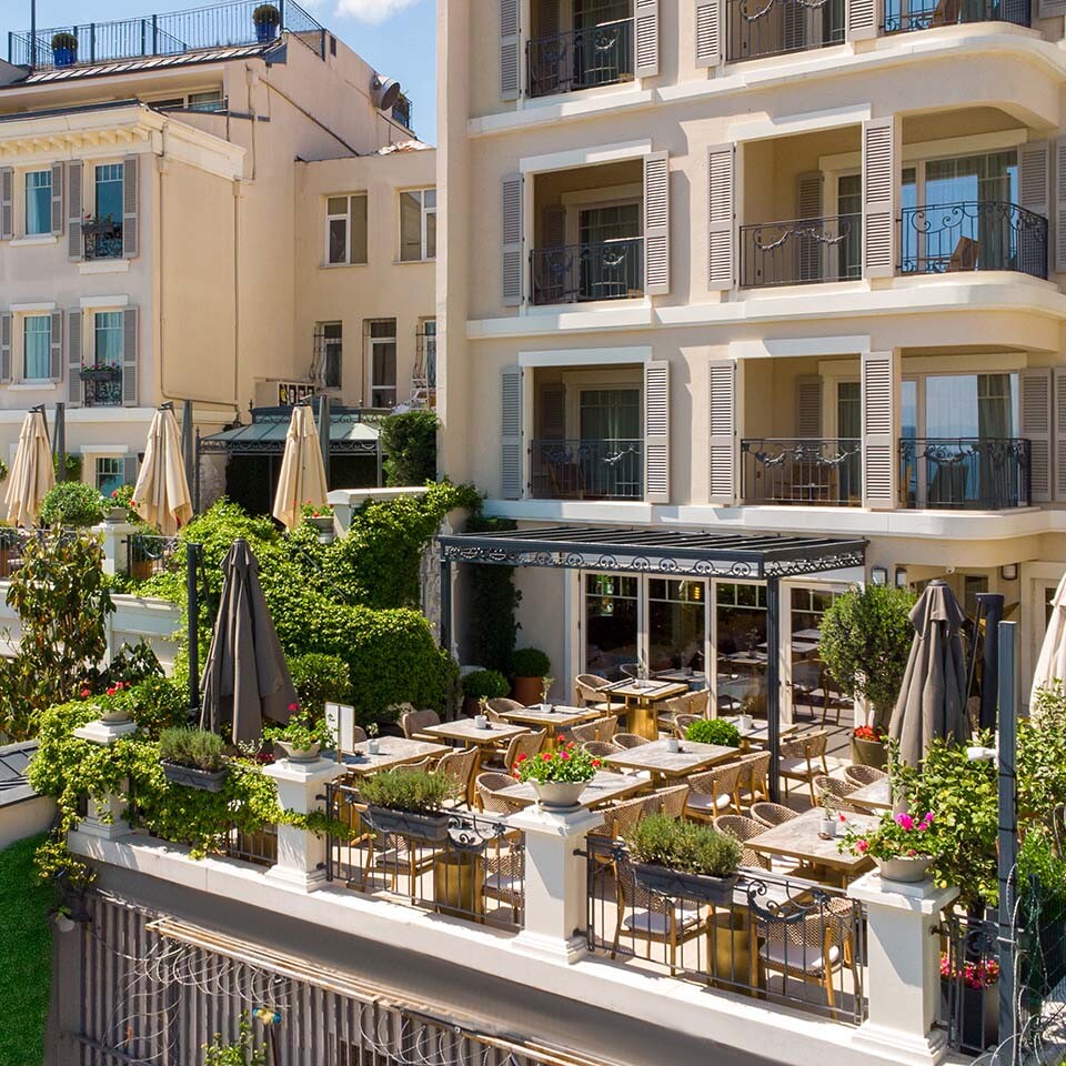
Extending the hospitality beyond its interior, the Intercity Hotel prioritizes outdoor spaces as integral components of the guest experience. Carefully arranged seating areas feature outdoor cane furniture, softened by cushions with inviting, homely patterns. These create intimate gathering points, fostering a sense of community and relaxation amidst the urban bustle. The generous incorporation of lush greenery transforms these areas into verdant retreats, injecting vibrant colour, natural textures, and a refreshing ambience. This deliberate integration of planting not only enhances the aesthetic appeal but also contributes to a more comfortable microclimate, offering a welcome respite.
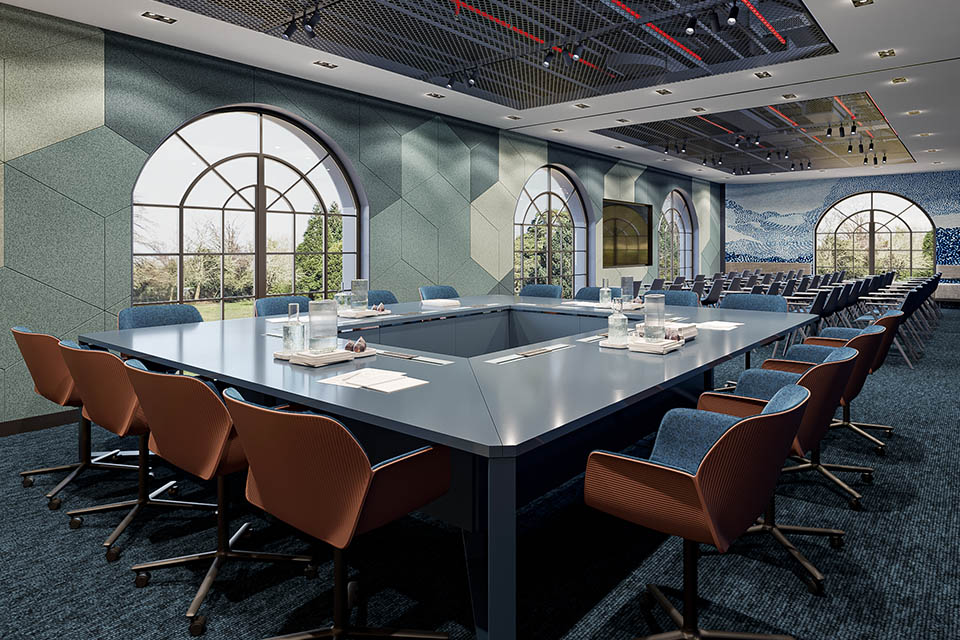
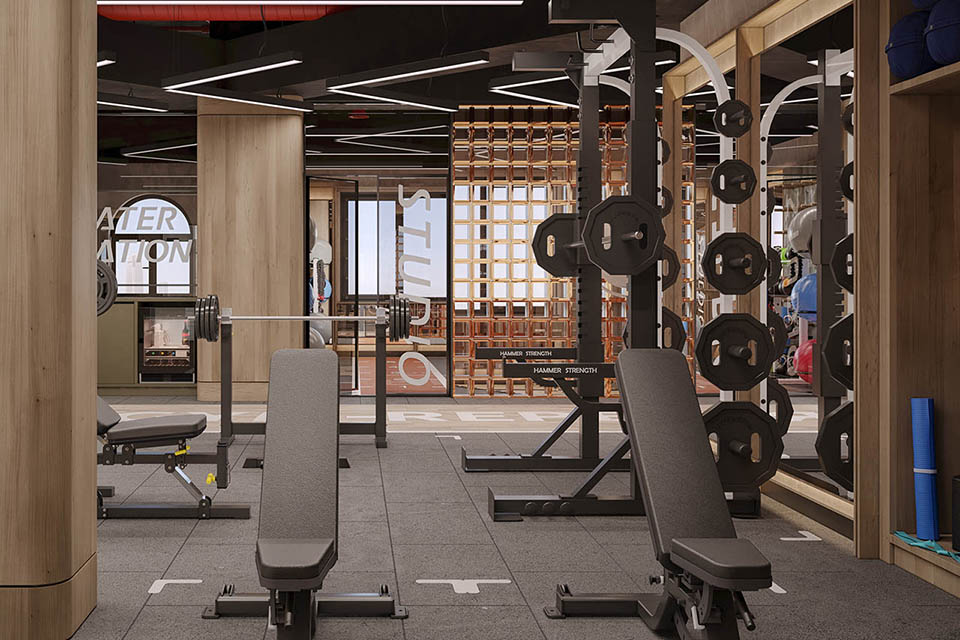
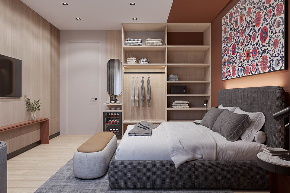
The Intercity Hotel carefully calibrates the atmosphere of each program to align with its specific function. The subterranean spa and swimming pool offer a tranquil and serene environment through considered material choices and nuanced lighting. On the ground floor, the various cafeterias and the restaurant each present unique ambiences, ranging from casually vibrant to more intimately refined, often defined by distinct material palettes and spatial arrangements. The conference hall and meeting areas prioritize functionality and a streamlined aesthetic through clean lines and carefully selected materials. Ascending the levels, the guest rooms provide comfortable and well-appointed havens for rest, while the suite accommodations on the upper floor offer enhanced amenities and a more sophisticated material palette.
The Intercity Hotel in Tashkent stands as a considered architectural response to the demands of contemporary hospitality. Through a refined orchestration of color, texture, and spatial design, the project offers a multifaceted and engaging environment for its visitors. The deliberate selection of materials and the strategic application of colour palettes reveal a nuanced understanding of how these elements can shape the human experience, resulting in a hotel that is both visually compelling and deeply hospitable. This project reflects a deliberate effort by the design team to craft spaces that resonate with a sense of both energy and comfort, leaving a lasting impression on those who pass through its doors.
RELATED PROJECTS
Sense Youth Boutique Hotel
Bodrum, TR
LUX* Resort & Residences
Bodrum, TR
Windmill Boutique Hotel
Bodrum, TR
Mula Hotel Narlı Building
Istanbul, TR